Roderic O’Conor (1860–1940)
Background and extra information about that time in history
Traditionally painting had been the medium of visual record. Photography usurped this function as this new medium could represent visual reality with an accuracy which painting could never hope to achieve. If the traditional function of painting had been removed, what was its new function to be? The artists’ response to this question was what informed the enormous transformation that took place in painting from the 1870's onwards.
Painting is essentially the interplay of form and colour. The monochrome photographs of the time could represent form with greater scientific accuracy than painting, but colour was still the preserve of painters. The development of scientific theories of colour served to further emphasise the importance of colour and brought about increased interest in colour and its application. The evolution of painting from 1870 onwards was dominated by the liberation of colour. Colour gradually became more a means of expression than an aid to visual record.
History favours labels of convenience. The era from 1870 onwards is an age rife with ‘isms’; Impressionism; Synthesism; Expressionism; Fauvism; Cubism, etc. These are but a few of the terms generated by this era. It is easy to look back and label these art movements, to list their founders and followers, to give their dates. This practice gives a false impression. This was a time of revolution in the visual arts. Every artist of merit sought his own means of expression.
Artists who took aspects of these movements and explored them to their own ends were the artists who produced works of genius. Such are the painters who evolved their medium. The emphasis placed on individual interpretation is what advanced painting so rapidly from the advent of Impressionism onwards. The career of Roderic O’Conor ran, more or less, concurrently with these events, a fact clearly discernible in his work.
Painting is essentially the interplay of form and colour. The monochrome photographs of the time could represent form with greater scientific accuracy than painting, but colour was still the preserve of painters. The development of scientific theories of colour served to further emphasise the importance of colour and brought about increased interest in colour and its application. The evolution of painting from 1870 onwards was dominated by the liberation of colour. Colour gradually became more a means of expression than an aid to visual record.

Roderic O’Conor left Ireland as a young man and spent
most of his life in France. He never really associated with
Irish artists there and it seems he only exhibited once
among them, with the result that he was virtually
forgotten in Ireland until quite recently. However, he is
one of the most interesting Irish artists. Born in Co.
Roscommon to the well-known O’Conor family of the
area, he studied in Dublin and Antwerp but soon went to
Paris, where he quickly found a new direction and
developed a style of strong, loose, Impressionist
brushwork and bright colours that capture the heat and
glare of the sunny French countryside. His subject matter
included landscapes, figure painting and still lifes with
no aspect dominating.
Most of O’Conor’s finest works were produced in and around Pont-Aven between 1892 and 1904. They are progressive, expressive, individualistic pieces. It was during these years that he developed his method of colouring in parallel stripes. His subject matter in Brittany was mainly exterior, i.e. landscapes and seascapes, although he also produced some portraits and a number of etchings. The influence of the Impressionists, Van Gogh and Gauguin is evident in the paintings he produced during this time.
To put Roderick O Conor in context below is a link to a short video of impressionism (the painting movement of the time during his early year)
http://www.youtube.com/watch?v=yJthUa536Hw
O’Conor and Paul Gauguin
O’Conor joined a community of artists that hadestablished itself around Paul Gauguin in Pont Aven in
Brittany. Gauguin had already left for his first trip to
Tahiti, but the spirit he created in the group remained,
and when the artist returned the following year the two
became friends. Although he was deeply impressed by
Gauguin, O’Conor’s work remained unique and
independent and is more comparable to a group of
artists working in France known as Les Fauves.
The Farm at Lezaven
One of his best-known works from Pont Aven is The Farmat Lezaven, Finistère (fig 5) featuring a sunlit farmhouse,
where the studio shared by some of the artists is glimpsed
against a glowing sky through dark trees. The field and wild
flowers are painted in harmonious reds, greens, pinks,
violets and oranges. The picture creates a sense of pattern,
with the dark green and purple uprights of the trees
breaking the bright horizontal shapes of the pink and
purple flowers and layers of greens in the undergrowth.

Influenced by Van Gogh
O’Conor was one of the first foreign artists to appreciate
Van Gogh’s work. Using pure colours and influenced by
Van Gogh, he was at his most expressive in his
landscapes and particularly his seascapes, using thick
paint and a striped application of paint in a strong and
exaggerated fashion.

Yellow Landscape, Pont-Aven, 1892

Works such as ‘ Field of Corn, Pont-Aven, 1892 and Yellow Landscape, Pont-Aven, 1892 clearly show an appreciation of Van Gogh’s technique. Their garish colour and expressive brushstrokes are typically Van Gogh, as is the subject matter, trees and cornfields.
Portraits of Breton peasants
O’Conor painted a series of portraits of Breton women in
traditional costume. Stripes of colour also feature
prominently in many of these, as seen in Bretonne
(fig 6), a portrait of a young girl with head raised and
tilted to one side. Some would say she has a haughty
expression as she stares bluntly at the viewer in an
unblinking stare, but there is also an innocence in this
gesture. It is as if she holds the pose patiently and waits
while the artist paints the dark shadow on the near side
of her cheek and neck in stripes of bright reds and greens
to contrast with the sunny yellow light on her face and
clothing.illuminated and soft reds and golds contrast with the
blues of the shadow, while soft brushstrokes contribute
to the peaceful atmosphere.

Brettone

La Jeune Bretonne
A gentler, more sensitive portrait is that of La Jeune
Bretonne (fig 7). In this quiet and contemplative work,
the model’s hands are clasped in front of her as she
gazes into a glow of light. One side is strongly illuminated and soft reds and golds contrast with the
blues of the shadow, while soft brushstrokes contribute
to the peaceful atmosphere.
Tips to help understand a portrait.
1. What is the person wearing?
2. What can you say about the pose: casual, playful, formal?
3. Are there signs of an occupation or avocation?
4. What are the physical dimensions of the canvas?
5. Is the sitter pushed up against the picture plane orfurther back into the
picture space?
6. Is the sitter facing forward (frontal), three quarter, orprofile?
7. What beside the portrait is in the picture: animals,weapons, tools?
8. Is the portrait a full-body portrait, half body, or justthe face?
9. Is it an individual portrait, a couple, or a group suchas a family?
10. What is the expression of the person? Who does this effect the mood of the painting?
11. What does the portrait tell you about that person?
12. How is the paint used to describe that person?
Later life
Throughout the early 20th century, O’Conor maintained
his independence from any group or movement and for
some years he did not exhibit although he painted
continuously. Because of his family connections in
Ireland he never had to worry about money, having
private means. In his later years he married a much
younger woman, had a studio in the south of France and
had one exhibition in 1937. He died in 1940.
Roderick O Connor, Short Youtube clip:
Art History Question- Roderic O Connor
'Une Jeune Bretone' by Roderic O Conor (1860-1940)
Describe and discuss this work refering to subject matter, composition, colour and style. AND
Name and briefly discuss one other work by Roderick O Conor. Illustrate your answer (label and explain illustrations).
PAUL HENRY

Portrait photograph of Paul Henry
Taken from 'Further reminiscences: Paul Henry' by Mabel Henry
Born in Belfast, Paul
Henry was for much of the 20th century, one of the country’s most
identifiable artists, with prints of his paintings of the west of Ireland
popularised by railway companies in the 1920s and Bord Fáilte in the 1940s. In
1898 he went to Paris studying under Jean-Paul Laurens. During his stay in
France he met his future wife Grace (née Mitchel) whom he married in 1903.
Moving to London, he was commissioned as an illustrator for journals and worked
as a book jacket designer. In 1910 he first exhibited at Dublin’s RHA and from
the next year onwards he made regular trips to Achill island, settling there in
1912, and then moving to Dublin in 1920. His early paintings of the west of
Ireland typically included figures, although as his work matured the artist
focused increasingly on capturing scenes of billowing cloud formations,
monumental hillsides and the glimmering lakes of Connemara and Wicklow.


For Paul Henry Achill Island was love at first sight and he instantly decided to remain on the island, allegedly tearing up his return rail ticket and scattering the fragments into the sea. As he later wrote in his autobiography:
..."As I wandered round and through the village [Keel], and out on the road that led to Pollough, and looked down on Dooagh and to the noble cliffs of Achill Head, I felt that here I must stay somehow or another. I would not go any further".Paul Henry was deeply moved by the harshness of life on Achill Island, both the living conditions and the hardness of the economic life. At that time Achill Island provided huge numbers of migratory labour to the farms of Scotland, as well as the usual supply of men for labour and women for domestic service in England, the United States and Australia. This left the island populated by young children and their mothers, and the elderly, for much of the year. Paul Henry's observations are recorded in an unpublished manuscript on life on Achill:
..."the people cling with pathetic heroism to their holdings with a dumb ferocity of affection. Existence [for many of them] would be simply impossible were it not for the money coming in from [relatives in] America".
(quoted in S.B. Kennedy, p43)
... "On a rude track converging on the road seven or eight women, each bent under a heavy creel of turf, walking barefoot in single file like a gang of slaves, passed towards the village ... A few women - not a man is to be seen - dressed in red with orange or mauve head shawls are dotted over the fields, bending over their spades, grubbing feverishly in the thorny soil'.
(S.B. Kennedy, p51)
The image of the peasant woman toiling in the field with her colourful shawl or headscarf is one that Paul Henry returned to frequently, borrowing heavily from Millet's famous paintings 'The Angelus' and 'The Gleaners'. In his later years on Achill, and certainly after he left the island in 1919, Paul Henry moved towards painting pure landscape without any figures in them.
However, despite these realities, there is scant reference in any of Paul Henry's works to the civil upheavals that transformed Ireland during his lifetime, nor any attempt to engage with the underlying political reasons for the harshness of life for the people of Achill Island. He chose instead to focus on a timeless struggle between man and nature - sometimes harmonious, as in the landscapes with cottages, and sometimes tragic, as in the Synge-inspired 'Waiting for the Boats'. This focus, at the expense of the ugly reality of human conflict and oppression, contributed in part to the popularity - in Ireland, north and south, and in England - of Paul Henry's vision of Ireland in the early years of the Free State

Paul Henry (1876-1958)
A Connemara Village, 1933-34
A Connemara Village, 1933-34
An unusually large work in Henry’s oeuvre, this painting ‘records with
great accuracy the view eastwards from the quay on the Clifden road just over a
kilometre west of Letterfrack, Co. Galway. The mountain in the background is
Doughruagh’ (S.B. Kennedy, ‘Paul Henry’, 2003). The cluster of diminutive,
whitewashed cottages, picked out by sunlight against a backdrop of mountains
and an impressive sky, is a motif that recurs in Henry’s landscape painting
from the early 1920s onwards. These cottages emphasise the grandeur of the
local scenery while simultaneously alluding to the isolation of the rural
communities and their reliance on the land. The turf stacks in the foreground
serve as further evidence of the integral link between the people and their
surroundings.
This identification of Paul Henry's paintings of a rural Arcadia as a symbol of the spirit of the West (and therefore of the true, authentic Ireland) achieved an international recognition in 1925. The London, Midland and Scottish (LMS) Railway Company published a poster featuring a reproduction of Paul Henry's painting 'In Connemara'. The poster was distributed widely to tourist bodies in Europe and the U.S. and proved to be hugely popular with the public (LMS sold almost 1,000 copies of the poster to members of the public between 1925 and 1926, and commissioned two further posters using Paul Henry reproductions). As a result of the LMS poster the Connemara picture became something of an icon. The Irish Times wrote in 1925: 'If thousands of people in Great Britain and America have been led this summer to think over the claims of Ireland as holiday ground, it is largely through the lure of Mr Paul Henry's glowing landscape of a Connemara scene'.

It is perhaps somewhat ironic that Paul Henry, who was so distressed by the impact of the tourism industry on the village of Dugort when he arrived on Achill in 1910 that he immediately moved to a more remote part of the island, should have contributed so much to tourism in Connemara and the west of Ireland. Paul Henry's paintings continue to be enjoyed to this day, and for many people still reflect a vision of Ireland that they like to see as 'true' and authentic. Paul Henry died in 1958.
This identification of Paul Henry's paintings of a rural Arcadia as a symbol of the spirit of the West (and therefore of the true, authentic Ireland) achieved an international recognition in 1925. The London, Midland and Scottish (LMS) Railway Company published a poster featuring a reproduction of Paul Henry's painting 'In Connemara'. The poster was distributed widely to tourist bodies in Europe and the U.S. and proved to be hugely popular with the public (LMS sold almost 1,000 copies of the poster to members of the public between 1925 and 1926, and commissioned two further posters using Paul Henry reproductions). As a result of the LMS poster the Connemara picture became something of an icon. The Irish Times wrote in 1925: 'If thousands of people in Great Britain and America have been led this summer to think over the claims of Ireland as holiday ground, it is largely through the lure of Mr Paul Henry's glowing landscape of a Connemara scene'.
It is perhaps somewhat ironic that Paul Henry, who was so distressed by the impact of the tourism industry on the village of Dugort when he arrived on Achill in 1910 that he immediately moved to a more remote part of the island, should have contributed so much to tourism in Connemara and the west of Ireland. Paul Henry's paintings continue to be enjoyed to this day, and for many people still reflect a vision of Ireland that they like to see as 'true' and authentic. Paul Henry died in 1958.
Paul Henry youtube Link;
Contemporary Irish Artists; See Link below
http://cmsold.pdst.ie/sites/default/files/PP14%20Irish%20Painting%2017th,%2018th,%20&%2019th%20C.pdf

Louis Le Brocquy


Video links about Louis le Brocquys painting "The Family".
http://youtu.be/HgPhsH1vyw4
http://youtu.be/YCYv0aXO27oQuick clip about his life and death
http://youtu.be/BcknyeCdkLg
Louis le Brocquy's A Family : 'An unwholesome and satanic distortion of natural beauty' 1
The Family, 1951
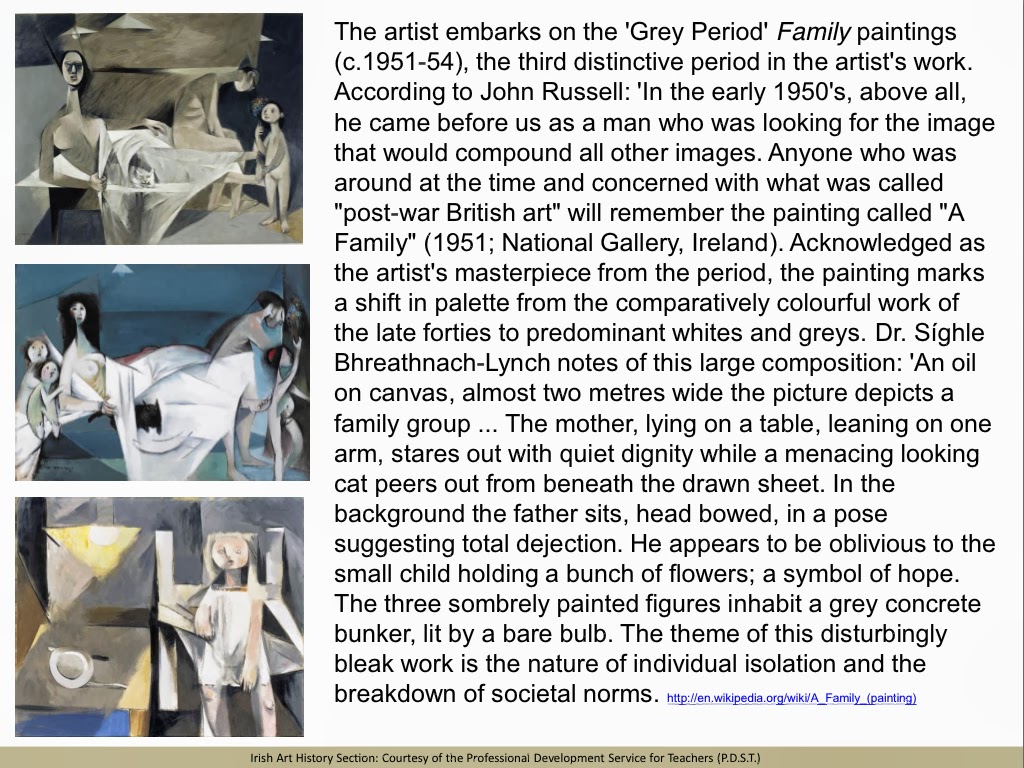
In 1992 the artist Louis le Brocquy (b.1916) was granted Ireland's highest cultural distinction by Aosdána , that of the rank of Saoi . 2 This honour was in recognition of "his creative work which has made an outstanding contribution to the arts in Ireland." 3 Ten years on his painting A Family (1951) is displayed in pride of place in the National Gallery of Ireland (Fig.1). This laudable celebration of an artist's talent by his own country men and women in fact marks 'closure' on an earlier history of rejection. The pinnacle of that negative reception was the reaction to A Family at the time of its production. Now acknowledged as a highly significant work in the history of 20 th -century Irish art, the response to it in Dublin in 1951/52 was decidedly mixed; from recognizing it as "a major work of art" 4 to denouncing it as "a diabolical caricature." 5 This article traces the history of the painting, particularly in relation to its reception at the time of its production. What precisely disturbed viewers about le Brocquy's interpretation of the theme and resulted in its being rejected by the committee responsible for acquisitions at Dublin's Municipal Gallery of Modern Art? The painting is also considered within the broader context of the place of modernism within a distinctive Irish cultural identity.An oil on canvas, almost two metres wide, the picture depicts a family group in faux-cubist style. The mother, lying on a table, leaning on one arm, stares out with quiet dignity while a menacing looking cat peers out from beneath the draw sheet. In the background the father sits, head bowed, in a pose suggesting total dejection. He appears to be oblivious to the small child holding a bunch of flowers; a symbol of hope. The three somberly painted figures inhabit a grey concrete bunker, lit by a bare bulb. The theme of this disturbingly bleak work is the nature of individual isolation and the breakdown of societal norms.
Le Brocquy states:
"I have always been fascinated by the horizontal monumentality of traditional Odalisque painting, the reclining woman depicted voluptuously by one Master after another throughout the history of European art - Titian's Venus of Urbino, Velazaquez' Roqueby Reclining Odalisque in her seraglio and finally the great Olympia of Edouard Manet celebrating his favorite model, Victorine Meurent.My own painting A Family was conceived in 1950 in very different circumstances, in face of the atomic threat, social upheaval and refugees of World War II and its aftermath. The elements in its composition correspond in some ways to those of Olympia , if not to Manet's cool sensuality. The female figure in A Family may be seen to take on a very different significance. The man, replacing Manet's black servant with bouquet, sits alone. The bouquet is reduced to a mere wisp held by a child. The Olympian black cat in turn becomes white, ominously emerging from the sheets. This is how A Family appears to me today. Fifty years ago it was painted while contemplating a human condition stripped back to Paleolithic circumstance under the electric light bulbs."
A Family was first exhibited along with works in a similar style by the artist in London at the Gimpel Fils Gallery in June 1951 and later in December at the Waddington Galleries, Dublin. 7 The show elicited much praise from eminent critics including John Berger and Eric Newton.
Writing in the Art News and Review Berger noted:
His style has developed and changed; his colours are pale and severe - the Family is mostly grey; his forms, in their movement both across and into the picture, are precise. This finesse implies - because le Brocquy's motive is always human - a tenderness which is not sentimental, and a sense of wonder which is exact; one thinks twice about the quite ordinary but in fact miraculous construction of any man's back, having looked at the father in the Family .Artist Anne Madden writes of le Brocquy's theme as the human condition being "stripped of irrelevance." This ability "not to seek to evade simple but difficult problems by relying on the grandiose cliché" was one also admired by Berger. Eric Newton, reviewing the work of a number of artists in London in The Listener , singled out le Brocquy as "a lyrical artist with an exceptional evocative gift" and an illustration of A Family was included in the review. 10 The painting was also featured during a talk on the BBC Third Programme.
The response to the Dublin show the following December was decidedly mixed. On the one hand there was open hostility to le Brocquy's work, while on the other, a small group of interested art lovers were prepared to present A Family to the Art Advisory Committee in charge of acquisitions for the permanent collection at the Dublin Municipal Gallery. 11 It was refused. 12 The sharply divided opinions on the painting and its rejection by the Committee bring into focus the polarization of views of those interested in the visual arts at this time. There were two critical camps; the traditionalists who constituted the majority of the art establishment in Ireland, and the small but highly active circle of those promoting modernism and contemporary art. 13 Each group held firm convictions on the subject of what constituted 'Great Art'. 14 Medb Ruane has stated that A Family represented a real challenge to the conservative art establishment, some of whom "had not yet come to terms with Post-Impressionism, let alone modernity." 15 For the traditionalists this challenging visual depiction was repugnant. It went against conventional notions of what constituted appropriate treatment of high-art themes. 16 Accordingly, all subjects should be treated with the supposed dignity and empathy befitting the noble art of painting and social themes should be kept within the bounds of propriety.
The artist's image of stark reality in the shape of the terrifying uncertainty of the post-War era and the resultant isolation of the family unit shocked rather than comforted. One letter writer to The Irish Times stated unequivocally that the picture in question is as remote from beauty as the utmost stretch of mortal imagination can conceive. The figures are bestial, horribly misshapen with heads and faces of idiots. If ordinary people met such figures in the streets they would flee from them in terror. 17
The critic Tony Gray saw no tenderness in the forms portrayed. 18 Rather he felt that they were "depressing and frightening" and the sombre palette merely "enhanced the despair of his theme." The Evening Herald headlined its review "What is it all about" and castigated the le Brocquy exhibition for representing what it called "the left in art" (an oblique reference to modernism). 19 The artist was accused of having gone the way of everything sensational, shallow and ephemeral. The 'Man About Town' column in the Evening Mail believed that the whole composition was "bewildering and repulsive" (the length of the woman's neck seemed to be especially abhorrent!). A rhetorical question implying a negative reply was posed, "What is the aesthetic value of these distortions"? 20 An editorial in the same newspaper broadened the enquiry to a consideration of the genuine value of modern art in general. Did it really contribute to culture or was it "a translation into farcical terms of all that is great and good in the work of the old masters?"

Fig. 2: Edouard Manet: Olympia ; click on the image to see an enlarged version of it
As the artist has made clear, A Family was following in an age-old artistic tradition in art: depictions of reclining figures. Indeed on close examination the elements in le Brocquy's composition correspond in many ways to those of Manet's painting (Fig.2). Each of the principal figures is presented in a prone position while propping themselves on one elbow in order to engage the viewer more directly. Their unswerving gazes are uniformly disconcerting. A number of the 'props' in the paintings are similar; the cat, the sheets, flowers, and the bed. There are also references to other great paintings. These are alluded to by critic John Russell, who recognized that le Brocquy had caught the mood of the times in his painting. 22 The bare bulb is reminiscent of Guernica and the reclining figure of Henry Moore's early sculpture and drawings. Le Brocquy, in the manner of earlier artists, like Manet and Picasso, was working in the ancient tradition of the 'major painting'; a work that summed up what a painter stood for and showed what he could do when at full stretch. And as in the case of earlier artists, critical reception to innovation depended largely on the viewer's own deeply held aesthetic ideals.
Those who admired le Brocquy's 'major painting' felt that its detractors were judging it solely in terms of its academic realism or rather lack of it. 23 It was argued that the artist painted in the way that he did for the only reason any creative person creates anything; because he feels he must, and because he enjoys doing so. Furthermore it was pointed out there was more than one way of judging the artistic worth of a painting. Slating it because it did not reflect reality was unjust. Apart from any literal significance which a painting may or may not have, it can be appreciated for its formal qualities (the composition, colour, line and application of paint). The protests by members of the Irish Exhibition of Living Art (IELA) on its rejection by the Art Advisory Committee extended the debate to other issues. 24 For instance, the make-up of the Art Advisory Committee was questioned. In spite of the fact that the IELA actively promoted modern contemporary art, none of its members had ever been invited on that particular committee. On the other hand, the opponents of such art were represented on it.
Modernists did not believe that a distinctive Irish art had to consist of countless scenes of peasants, thatched cottages and Irish scenery and little else. 33 Their subject matter was not exclusively focused on 'Irishness' in terms of its content and their 'language' of style was grounded in avant-garde ideas emanating from abroad. In le Brocquy's case his art at this time stemmed from a preoccupation with the human predicament. 34 Paintings like A Family expressed a concern for the whole of humanity rather than exclusively his own countrymen and women. But it would be a mistake to think that the artist had little sense of a national identity. As a child growing up in Ireland he remembers not feeling particularly Irish. 35 But once he left the country that irrevocably changed. 36 His early European experience convinced him of his own nationality. "I became vividly aware for the first time of my Irish identity to which I have remained attached all my life."
Presented as a gift in 2001 to the National Gallery, A Family is rightly recognized as a seminal painting in the history of 20 th -century Irish art. It is not only an important transitional work in the artist but one anticipating modernism as an everyday style in Irish art. All of this is implicitly acknowledged in its being on display to the public. To date, the exception to the policy of only displaying work by dead artists in the Gallery is the continuous acquisition of portraits by contemporary artists for the National Portrait Collection. Le Brocquy is the only living artist to have a work on show as part of the permanent collection. As Medb Ruane has pointed out, the prophet has finally been honoured in his own land.
Francis Bacon (1909-1992)

Who Was Francis Bacon?
·
Francis Bacon (1909-1992) is one
of the most famous artists of the 20th century. Although he lived most of his
life in London, Francis Bacon was born in Dublin in 1909 and lived in Co.
Kildare with his family.
FRANCIS BACON (1909-1992)

FRANCIS BACON (1909-1992)
'Self Portrait', 1971 (oil on canvas)
Francis Bacon, the artist, paints provocative and disturbing images that carry a raw sense of anxiety and alienation. They reflect that existential fear, loathing and incomprehension at the atrocities of the Holocaust that came to light at the end of World War Two.'Self Portrait', 1971 (oil on canvas)
Francis Bacon was was born in Dublin on 28 October 1909, the second of five children. He often came into violent conflict with his intolerant and authoritarian father who was a horse trainer and major in the British army. After irreconcilable differences over his sexuality, he left home at the age of sixteen to live with an uncle in Berlin. The Berlin that he arrived in was a melting pot for radical social and political ideas and had evolved as the capital of European culture in the 1920’s.
In 1928, Bacon moved to Paris where he decided to become an artist after seeing an exhibition of Picasso’s work. The following year he returned to London and set up a studio in South Kensington. His art was influenced by Surrealist abstraction but it did not gain much critical success. Around 1944, he destroyed most of the work he had produced to date as he believed that it failed to communicate the way he felt about the world.
IMAGES OF PRIMAL ANGST

FRANCIS BACON (1909-1992)
'Three Studies for Figures at the Base of a Crucifixion', 1944 (oil on board)
'Three Studies for Figures at the Base of a Crucifixion', 1944 (oil on board)

'Three Studies for Figures at the Base of a Crucifixion'
(left hand panel)
(left hand panel)

'Three Studies for Figures at the Base of a Crucifixion'
(center panel)
(center panel)

'Three Studies for Figures at the Base of a Crucifixion'
(right hand panel)
(right hand panel)
SEVERAL STYLISTIC ELEMENTS that recur throughout Bacon’s body of work are introduced in‘Three Studies for Figures at the Base of a Crucifixion’:
THE CRUCIFIXION AND GREEK MYTHOLOGY - Crucifixion themes and references to Greek mythology, particularly the 'Oresteia' trilogy by Aeschylus, are often used symbolically in the subjects of Bacon's paintings from this time onwards.
USE OF THE TRIPTYCH FORMAT – the triptych, a painting composed of three separate panels, was a devotional format that was first used in Christian altarpieces. Bacon used this form of display for two reasons. First, exhibiting such despairingly secular subjects in a religious format could only be viewed, in the context of the time, as a calculated act of desecration that would amplify the shock value and emotive response to his images. Secondly, the adjacent frames of a triptych arrangement allow Bacon to conduct a kind of abstract or psychological narrative between the consecutive images. The idea to use a triptych format was probably inspired by the expressionist paintings of Max Beckmann which Bacon would have seen in Berlin.
SEQUENTIAL IMAGES

EADWEARD MUYBRIDGE (1830-1904)
'The Human Figure in Motion' 1880's (photograph)
SEQUENTIAL IMAGES - 'I see images in series. And I suppose I could go on long beyond the triptych and do five or six together, but I find the triptych is a more balanced unit'. Francis Bacon never drew from life and always worked from photographs. He had a copy of Eadweard Muybridge’s pioneering book from the 1880’s, ‘The Human Figure in Motion’ which explored movement through series of still sequential images of people walking, running, jumping and wrestling. Muybridge’s photographs can be recognized as the source for many of the figures that appear in Bacon’s paintings. Another book that the artist referred to for some of his more tortuous poses was Clark's 'Positioning in Radiography'.'The Human Figure in Motion' 1880's (photograph)
ANTIQUE FRAMES WITH GLASS – Bacon mounted his paintings behind glass and used traditional heavy frames. He covered his paintings with glass as he liked the subtle interaction between the viewer and the image that was created by its reflection. The traditional frames were a device that associated his art with the dignity and substance of the old masters. Francis Bacon’s most famous work, ‘Study after Velazquez's Portrait of Pope Innocent X’ is based on the painting by the great Spanish master.
'THE SCREAMING POPE'

FRANCIS BACON (1909-1992)
'Study after Velazquez's Portrait of Pope Innocent X' 1953 (oil on canvas)
In 1953, Bacon painted ‘Study after Velazquez's Portrait of Pope Innocent X’. This painting, commonly referred to as 'The Screaming Pope', was based on Velazquez's 'Portrait of Pope Innocent X' of 1650 and is considered to be Francis Bacon’s masterpiece.'Study after Velazquez's Portrait of Pope Innocent X' 1953 (oil on canvas)

DIEGO VELÁZQUEZ (1599-1660)
'Portrait of Innocent X', c.1650 (oil on canvas)
Velazquez's portrait is a very skilful work as it conveys the dignity and authority of the Pope, the most powerful figure in the world at that time, while subtly revealing the suspicions and doubts of the inner man.'Portrait of Innocent X', c.1650 (oil on canvas)
Bacon was obsessed by this image and between 1951 and 1965 he painted around forty five variations of the subject.
The idea of producing variations on a work from the past was probably inspired by Picasso who reinterpreted works by Grünewald, Delacroix, Manet, Gauguin and Velazquez himself. Bacon said,‘Picasso is the reason why I paint. He is the father figure, who gave me the wish to paint………. Picasso was the first person to produce figurative paintings which overturned the rules of appearance; he suggested appearance without using the usual codes, without respecting the representational truth of form, but using a breath of irrationality instead, to make representation stronger and more direct; so that form could pass directly from the eye to the stomach without going through the brain.’

TITIAN - Tiziano Vecellio (1508-1576)
'Portrait of Cardinal Filippo Archinto' 1558 (oil on canvas)
Bacon said that never saw Velazquez's original painting and worked from reproductions. He also used other photographic sources to conjure up the final image of the his 1953 version. Titian’s portrait of Filippo Archinto, where the cardinal archbishop of Milan is partially obscured by a transparent curtain, was probably the inspiration for the ghostly veil of paint that screens Bacon’s Pope.'Portrait of Cardinal Filippo Archinto' 1558 (oil on canvas)

SERGEI EISENSTEIN (1898-1948)
‘The Battleship Potemkin’, 1925 (still photograph from the film)
The inspiration for Bacon’s head of Innocent X comes from a still photograph from ‘The Battleship Potemkin’ (1925), a silent black and white film by Sergei Eisenstein. The image depicts the panic of a wounded nurse whose smashed pince-nez spectacles are splayed across her blood stained face. This fearful image held a fascination for Bacon who always kept a copy of it in his studio. It encapsulates his philosophy, ‘Painting is the pattern of one's own nervous system being projected on canvas’.‘The Battleship Potemkin’, 1925 (still photograph from the film)
If Velazquez's 'Portrait of Pope Innocent X' portrays the public face of power while hinting at the private flaws of the man behind it, then Bacon’s ‘Study after Velazquez's Portrait of Pope Innocent X’ broadcasts his inner psychoses.
Bacon’s Pope inhabits an ethereal world of perpetual torment – a living hell from which there is no escape. He is paralysed with pain and fear, and jolted with shocks from his golden throne which has been transformed from a symbol of authority into an instrument of torture. The composition reaches its focal point as a primal scream shrieks from the pope's mouth. This is a scream that we have heard before: it echoes back to birth of modern expressionist art - ‘The Scream’ of Edvard Munch at the end of the 19th century.
Francis Bacon's art is full of paradox - he both repulses and seduces his audience simultaneously. He repulses them with his shocking subject matter and his dispassionate gaze which has the detached curiosity of a scientist watching a lab rat. However, he also seduces them by the rich sensual qualities of his beautiful paint surface with its electrifying brushwork and rich expressive colour.
The same kind of contradiction confounds his subject matter. While ‘Study after Velazquez's Portrait of Pope Innocent X’ attacks the authority of the Catholic Church, the social and religious establishment of his Irish childhood, it is also part of an obsessive fascination with its iconography (45 variations on the 'Innocent X' theme is certainly obsessive). Bacon, himself, revelled in such ambiguities, 'The job of the artist is always to deepen the mystery.........If you can talk about it, why paint it?'
FRANCIS BACON NOTES

FRANCIS BACON (1909-1992)
'Painting', 1946 (oil and pastel on linen)

'Painting', 1946 (oil and pastel on linen)
Summery
- Francis Bacon, the artist, was born in Dublin on 28 October, 1909, the second of five children.
- He left home at the age of sixteen and went to live in Berlin.
- In 1928 he decided to become an artist after seeing an exhibition of Picasso’s work in Paris.
- His early work (1929-1944) was influenced by Surrealism but did not gain much critical success.
- In 1944 Bacon exhibited ‘Three Studies for Figures at the Base of a Crucifixion’ to a public outcry due to its horrific imagery. This was the key painting in the development of Francis Bacon’s work.
- After painting ‘Three Studies for Figures at the Base of a Crucifixion’ he destroyed most of his early work as he believed that it failed to communicate the way he felt about the world.
- ‘Three Studies for Figures at the Base of a Crucifixion’ introduces many of the characteristics associated with Francis Bacon’s art: mutilated imagery, a sense of anxiety and alienation, the triptych format, antique gilt frames with glass and subjects that relate to the Crucifixion and Greek mythology.
- Bacon never painted from life - he always worked from photographs.
- Photographic references that Bacon frequently referred to were Velazquez's 'Portrait of Innocent X', the wounded nurse from the film 'The Battleship Potemkin', Muybridge’s ‘The Human Figure in Motion’, Clark's 'Positioning in Radiography' and medical textbooks that illustrated diseases of the mouth.
- Bacon's art was seen as a metaphor for the corruption of the human spirit in the post World War Two era.
- Bacon often painted variations of the same subject and sometimes revisited certain subjects many years later. ‘Three Studies for Figures at the Base of a Crucifixion’ has a later version painted in 1988.
- Francis Bacon died of a heart attack in Madrid in 1992
Francs Bacon
"You can't be more horrific than life itself." - Bacon

Francis Bacon (1909-1992)
Record-Breaking Artist
In November 2013, Bacon's life-size triptych Three Studies of Lucian Freud(1969) was sold at Christie's postwar and contemporary sale, in New York, for a record breaking $142.4 million. |
Powerpoint slideshow provides bullet point important facts and information about Francis Bacon. Please click the link below;
Jack B. Yeats
- Jack B Yeats came from an Irish background. His father John Butler Yeats, was a portrait painter and his brother, William Butler Yeats, became one of
- Jack Yeats always signed his name Jack B. Yeats to avoid confusion with his father, but to this day one is still mistaken for the other.
- Most of his childhood was spent apart from his parents, brother and sisters, with his grandparents at his mothers home in
- He enjoyed the atmosphere of the west with its rugged coastline, mist, rain, constantly changing weather conditions, space and colour, were to enrich and inspire his work.
- He said ‘A true painter must be part of the land and the life he paints’.
- Like other members of his family, he drew constantly from a young age, and when he rejoined the family in
- He attended various art schools in
- He was unaffected by European art developments and his travels around Ireland observing horse racing, country fairs, traveling circuses and the streets of Dublin appear to have satisfied his own imagination. His art is deeply personal and cannot easily be defined, but for some time after he returned to
- He chose small incidents, like three women on a train deep in conversation.
- Later, his work developed into strong dramatic painting for which he has become famous. He drew heavily from memories and sketches of his youth and the smallest incident could result in dramatic possibilities.
- He was a painter of inner vision and poetry, capturing a world of landscape and memory, half imaginary, half fact, caught between reality and fantasy.
- From his traditional period, his painting ‘The Liffey Swim’ captures the excitement of this annual event in
- He painted with loose brush strokes in his later works and emotion became a stronger feature in his work.
- He felt that the paintings could speak for themselves, he said ‘It doesn’t matter who I am or what I am, people may think what they will of my pictures’.
- Another of Yeats most common images involved horses, and though he was never a horseman himself, he had a great affection for them. ‘For the Road’ expresses the understanding between horse and rider and the light of hope and optimism at the end of the tunnel.
- He died in March 1957 and has gained widespread international recognition as
The Liffey Swim – Jack B Yeats
· The Liffey Swim is an annual race in Dublin's main river, the Liffey and is one of Ireland
· Yeat’s composition has us in the action, a bystander craning over the other viewer’s heads. It is as direct a statement as an artist can make- We’re in this together.
· One of the earliest Liffey Swims was immortalized in the Jack B. Yeats 1923 painting entitled The Liffey Swim, which was to win him a silver medal at the 1924 Paris
· In the painting there were lots of people looking out on the Liffey watching the Liffey Swim, and there were three people in the water. Some of the people were on a tram. The river looked dangerous because the water had red streaks in it and red was a symbol for danger.
· There is freedom and spontaneity in his use of color and less evidence of planned drawing in this work.
· The painting represents the development from his illustrative phase (where he drew cartoons & caricatures for magazines & newspapers) to his later use of free flowing color. It records the annual swim down the river Liffey in the city of Dublin
· There is a man wearing a brown hat with a black band near the front of the painting. He is looking away from the race straight out of the painting. This is said to be a self portrait of the artist.

The Liffey Swim
For the Road – Jack B Yeats
· The horse hears its master’s call and gallops towards him on a road through a dark forest. A figure silhouetted at a distant tunnel of light beckons, drawing the horse out of the darkness and into the light. The darkened wood is evident by touches of red and yellow.
· The horse, flecked out in different tones of blue with a palette knife, exudes a magical, almost translucent quality as if a vision or apparition.
· The excitement of the horse on being called to undertake its journey symbolizes Yeats positive attitude to life, which he saw as a progression towards a goal with a sympathetic companion. For the road seems to be a metaphor for the uncertainty and confusion of our journey through the darkness of life into the new light of peace and freedom we can barely glimpse.
· There is great freedom of the brushwork in this painting, especially in the horse, conveying the notion of excitement, life, energy & speed.

For the Road - by Jack B Yeats

Comic Strip - his earlier work
________________________________________
Nathaniel Hone - Irish painter
Irish painter
Nathaniel Hone – 1831 – 1917 – Irish artist
About him:
1) Famous Irish landscape painter
2) Born in Dublin
3) He started his career as a railway engineer then at 21 he was determined to become a professional painter.
4) Began his art studies in Paris & stayed in France
5) He studied the human figure & drawing & he visited ‘La Louvre’ museum in Paris
6) He then went to Barbizon
7) He studied composition & how to achieve light on the canvas.
8) He developed a deep feeling for the colour of a landscape & the skill to reproduce it, which made him one of the most famous Irish landscape artists.
9) He had a fascination with light and focused on tone (shading with light & dark) in his paintings.
10) He left Barbizon in 1870, traveled to Normandy , Brittany , Paris & Italy before finally returning to Ireland
11) Exhibited his paintings regularly at the RHA (royal Hibernian academy) and he made elected professor of painting at the RHA in 1894, a title which he held up until his death.
12) He settled in malahide.
13) Today his art work is displayed in ‘The hugh lane gallery’ in Dublin , ‘The tate gallery’, London , ‘The national gallery of Ireland’ in Dublin as well as in the ulster museum in Belfast

Rough sea at Bundoran - Nathaniel Hone
Philip Treacy


His creations have graced the heads of some of the
biggest names on the celebrity scene. Diana Rigg waxes lyrical over "the
wit, the audacity, the sigh of feathers, the glow of velvet" of his work,
Boy George is a fan he owns a cheeky red devil number, complete with horns -
and the Duchess of York is just one of a number of British aristocrats to have
sported his headwear.

Young Irish
milliner Philip Treacy has come a long way from his roots in the Galway village
of Ahascragh, with its population of just 500. Born the second youngest of
eight children to a baker and housewife on May 26, 1967, Treacy studied at the
National College of Art and Design in Dublin before moving to London to attend
the prestigious Royal College of Art in London. There he specialised in hat
design, fashioning his first efforts from bits and pieces picked up in local
flea markets.
His graduation show in 1991 caused a fashion sensation, and it wasn't long
before his innovative and outrageous confections caught the attention of some
of the world's leading fashion designers. His sculptured headgear was soon
topping off catwalk creations by the likes of Chanel, Valentino, Versace and Rifat Ozbek. That year
the young designer established his own company, Philip Treacy Ltd, and went on
to win the title of Accessory Designer of the Year at the British Fashion
Awards in 1991, 1992 and 1993, and then again in 1996 and 1997.
1992: Won his second British Designer of the year award (Philip was to win three more) and
started designing hats for the High Street.
“Hats are for everyone. We all have a head so we have the possibility to wear a hat. You feel
better for wearing them. I was happy to be able to make hats that anyone could afford.”
1993: Staged his first fashion show- all black hats- in the Harvey Nichols department store
during London Fashion Week. The supermodels of the era- Naomi Campbell, Yasmin Le Bon,
Kate Moss, Stella Tennant and Christy Turlington- all modelled for him.
“I phoned up Christy Turlington to say that I was having a show and would she do it for me? She
agreed and the rest followed on. Naomi Campbell’s agent called the next day. Kate Moss
complained that I hadn’t asked her. London was in a lull then. The media went crazy when all
those girls did my show and it completely changed perceptions of the hat.”
When, in 2000, he was invited by the Chambre Syndicale, the governing body of
French fashion, to participate in the Paris haute couture shows, he became the
first millinery designer to do so in 70 years. It was a tremendous honour and
marked a major milestone in the career of the young Irish lad who had never
seen a city until he was 17. Although he has designed signature, one-off pieces
for clients such as Madonna, Celine Dion, Joan Collins and Goldie Hawn which bear a price tag of
£1,000 upwards, Treacy is equally adept at practical rain hats as demonstrated
in the range he created for British chainstore Debenhams.
His designs for the Chanel show in 1998 featured demure little cloche-style
efforts with outsize Sixties daisies, but he is best known for his enormous,
gravity defying sculptures and surreal extravagances which have a habit of
provoking fashion writers to new adjectival heights. "A Day-Glo blue sea
anemone on viagra," enthused one Time magazine reporter, attempting
to describe a spiky number sported by Alek Wek at a 1999 show in New York.
2006: Philip Treacy for Umbro launches at London Fashion Week. The collection is a fusion of
the two brands and delivers a complete package of men's clothing that is a synthesis of both
brands' strengths and demonstrates: glamour, colour, shape, quality, movement and
performance.
The collection combines all these elements, and the design, attention to detail, fabrication and
cut, make it the ultimate expression of luxury fashion and performance wear.
“I felt sportswear lacked in style, I wanted to design a collection that is both functional and
stylish. Sports wear is a language in fashion today.”
April: Philip is given an Honorary Doctorate, honoris causa, by The National University of Ireland.
“I make hats because I love hats. It‘s an enigmatic object that servers the human purpose only
of beautification and embellishment and making one feel good whether you’re the observer of
the spectacle or the wearer.


INSPIRED BY SURREALISM (DALI) Artists painted unnerving, illogical scenes with photographic precision, created strange creatures from everyday objects and developed painting techniques that allowed the unconscious to express itself and/or an idea/concept.


A hat is a positive symbol. A good hat is the ultimate glamour accessory. It thrills observers
and makes the wearer feel a million dollars. This creates a high status of desirability and
although the images received can seem out of this world the conspicuous consumer relates
strongly to it. The message is simple and absolute, a great hat exists outside it’s own time.
I believe in beauty and elegance and communicating thoughts and dreams in a visual way. I
started designing hats 15 years ago while a student at the Royal College of Art. It was at a time
when hats were perceived publicly as something worn by ladies of a certain age, and something
from a bygone era. I thought this was totally ridiculous and simply believed “we all have a head,
so everybody has the possibility to wear a hat.” I love to work with my hands making something
from nothing – turning 2 dimensional material into a 3 dimensional object is the penultimate
moment of creativity of my craft. I have had the greatest pleasure of having the opportunity to
challenge people’s perception of what a hat should look like in the 21st century.”


Today, Treacy's work has moved beyond the bounds of mere headwear, earning
itself display space at both London's V&A and the Met in New York.
The term milliner has evolved to describe a person who
designs, makes, sells or trims hats primarily for a female clientele.
Orchid Inspired collection
Treacy’s Millinery Style/Technique
Treacy's
millinery designs reflect his unquestionably vivid imagination, drawing upon
diverse subjects such as surrealism, the dance of Martha Graham, or religious
and historical imagery. Creating a hat, Treacy asserts, does not require space
age influences; he prefers to plunder the past for inspiration and then make it
appear totally new. A floral Treacy hat is a crash helmet covered in flowers
and butterflies; a towering turban is created by an intricately wrapped blanket
with fringed edging; a large cluster of black feathers are tied together
with white feathers to form a brim and crown.
Treacy's
hats, like those of other British milliners, are often described as eccentric.
The designer attributes this eccentricity to the British being associated with
idiosyncrasy, but says he does not set out to create deliberately unusual hats.
Using what he describes as "boring" fabrics, Treacy begins working
upon these materials with different treatments—feathers, for example, are
singed so they take on the appearance of very fine gossamer.
An
important factor in Treacy's work is his mastery of highly skilled traditional
millinery techniques which ensure the correct balance, fit, and proportion for
the hat which he concedes are as much mathematical as
aesthetic. It is this artisan approach, with the emphasis on craft and
technique, that characterizes much of Treacy's work. He produces hats for many
different companies, both couture houses and ready-to-wear firms, and his
annual shows in London and New York have been sponsored by a who's who of
fashion and business, from Debenhams and Rolls Royce to Swarvorski Crystal and
Max Factor.
Treacy's ability to work at all levels of the market, from the costly couture creations to the less expensive ready-to-wear field,
illustrates his versatility as a designer for whom price barriers are seen as a
challenge rather than an obstacle. While
Treacy's use of imagery and visual effects for his millinery creations is a
vital element in his success, fashion critic Brenda Polan claims Treacy's
mastery of technique is what singles him out as a great milliner, stating,
"The balance of his hats, their swooping and curving, is perfect. A Treacy
hat sits naturally upon the head, its proportions complementing those of the
body, its horizontal and vertical lines extending and dramatizing the planes of
the face. It is a perfection only an obsessive can achieve."
Obsessive
or not, Treacy creations are unique and in demand. The designer branched out
into accessories in 1997, and in 1999 was asked by the Federation Françoise de
la Couture to show his hats during the spring-summer haute couture
presentations. Treacy, honored and excited by the prospect, put together a
small, specialized collection, telling Women's Wear Daily (13
December 1999) "I can't compete with the multizillionaire designer
companies, so I plan to do a very small, discreet collection…. It's important
to give a profile to hat making; hats and headdress have
been around since the beginning of time, despite the fact that many people say
hats are finished."
Response
to Treacy's highly anticipated catwalk collection were enthusiastic, with Women's
Wear Daily (20 January 2000) declaring, "Treacy's hats were
sculptural, exquisite…. This season, he's fallen head over heels for orchids,
and he delivered a hothouse full of exotic hand-painted blooms that were
fabulous." Succeeding shows continued to be the rage for critics and
fellow designers alike, placing Treacy firmly in the upper echelons of fashion
royalty. His aim, however, is simple—"The object of the exercise is to beautify
women," Treacy had explained to Women's Wear Daily (20
January 2000). "I want to inspire young people to wear hats and to think
of hats as something new and modern. In our parents' generation, to wear a hat
used to be to conform. Now, to wear a hat is to rebel." Well said by the
master.
For more on Philip Treacy click the link below;
Philip Treacy's Orcid Collection
http://www.orchidsinfo.eu/en/consument/news/news-archive/famous-hat-designer-reveals-orchid-hat-collection-and-receives-own-orchid--
Sample Questions
Select one of the following:
Roderic O’Conor (1860 – 1940)
Paul Henry (1876 – 1958)
Louis Le Brocquy (1916 – 2012)
Brian Maguire (b. 1951)
Gwen O’Dowd (b. 1957)
Willie Doherty (b. 1959)
Philip Treacy (b.1967).
Describe and discuss the work of your chosen artist/designer making detailed reference
to two specific works. Refer to style, subject matter, materials/media, techniques and
influences.
Illustrate your answer.
Jack B. Yeats (1871-1957) was interested in the expressive power of colour.
Discuss this statement with reference to “Men of Destiny” illustrated on the accompanying
sheet. Refer in your answer to subject matter, composition, style, and technique.
and
Name and briefly describe one other painting by Yeats which is typical of his style.
Illustrate your answer
Incredible blog! Your style of composing is wonderful. It is very refreshing. I want to be ready to compose like you too when editing a thesis. You can review this site where offer amazing services regarding composing essay. It is so useful site to student. Keep it up!
ReplyDelete